
INTRODUCTION
In 2009, Coca-Cola Company came out with an ad campaign called “Open Happiness.” Coca-Cola started this campaign to encourage people to find happiness in the simple things in life (while enjoying a Coke of course.) This campaign was developed by the Wieden and Kennedy Creative agency.
ANALYSIS
CONTRAST
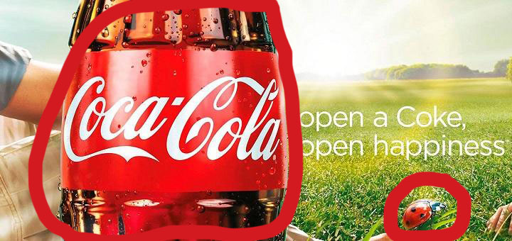
Contrast is quite recognizable by looking at this ad. Right away, the first thing you notice is the Coca-Cola bottle. It informs the viewer this is a Coca-Cola ad. Not only is the bottle enlarged, but it has a brighter more iridescent color. The lady bug is also in contrast with the rest of the advertisement. The lady bug is much smaller in contrast to the large Coca-Cola bottle, but like the bottle it’s colors are brighter in contrast with the background.
REPETITION

Repetition is used by using both forms Coca-Cola can be recognized by. Everyone knows that a Coke is Coca-Cola and Coca-Cola is a Coke. The advertisement uses repetition to let their viewers recognize who the advertisement is for.
ALIGNMENT

The alignment of this ad is appropriate for allowing Coca-Cola to get their point across. The Coke bottle is aligned on the left side of the image. This is a good strategy because as humans we read left to right. Automatically our eyes start on the left side and recognize the contrasted Coke bottle. The text on the ad is aligned on the right side and centered both vertically and horizontally. It’s a subtle placement compared to the large Coke bottle.
PROXIMITY

The elements in this advertisement are located in close proximity to each other. The Coke bottle is placed next to the text and lady bug because they all tie into the overall message of the ad. Just from looking at the proximity of the elements you recognize that by opening a coke you are able to recognize the simpler things in life.
COLOR

The color scheme portrayed in this advertisement is essential to sending the right message. The classic red color is a signature to Coca-Cola and next to the subtle, simpler colors of the surrounding elements shows that the main focal point is the Coke. The lady bug is also the red color and helps the viewer recognize it’s importance.
CONCLUSION
This advertisement proves to be precise and straight to the point. Open a Coke, enjoy the small things in life. Even though this advertisement is straight to the point, it also helps you take a step back and try to recognize the simpler things in life.
Coca-Cola presented an advertisement with good design elements. Altogether the use of contrast, repetition, alignment, proximity, and color used properly make for a great advertisement.

