INTRODUCTION
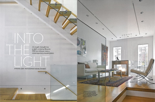
Photographs by: Michael Stavaridis
Website: https://www.bostonmagazine.com/2013/01/08/contemporary-beacon-hill-townhouse/
Featured in “Boston Home Magazine 2013” is this modern Townhouse. The photographs and typeface are modernly influenced. A couple transformed a “19th Century Beacon Hill Townhouse into a contemporary masterpiece.
ANALYSIS: Typeface
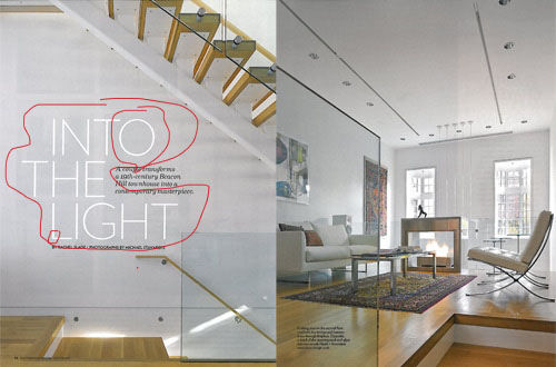
Sans Serif
The text shows two contrasting typefaces on the image. The first most noticeable text “INTO THE LIGHT,” is shown in Sans Serif. This can be labeled as a “Geometric” Sans Serif because the letters are geometrically shaped. Specifically the O’s. You could also notice there are no contrasts between strokes.
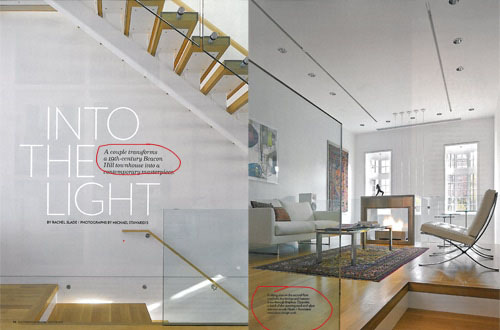
Serif
The next typeface shown is Serif. Simply because of the projection on the ends of the strokes. It shows angled ends and minimal contrast.
Contrast between the Typeface
The two types of typeface are contrasting in both size, style, and color. Immediately as the ad is looked at the viewers eyes are drawn to the Sans Serif, making it obvious that this is the most important part of the advertisement. After looking at that, then your eye is drawn to the rest of the text because it is much smaller and is noticeably less important.
ANALYSIS: Photography
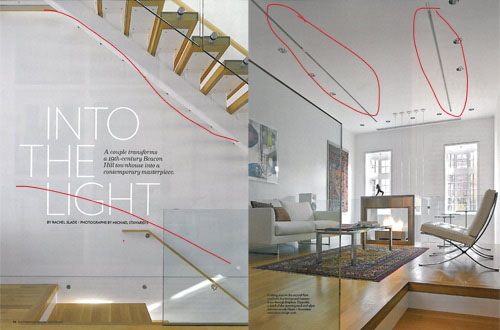
The photo on the left shows Rule of Thirds(vertically.) The white space between the two staircases divides both staircases into separate focal points. It shows the importance of each staircase. It also plays in the overall design of the theme.
The photo on the right is an example of leading lines. The decorative lighting on the ceiling is a leading point for the rest of the photograph.
3 Photos
LEADING LINES
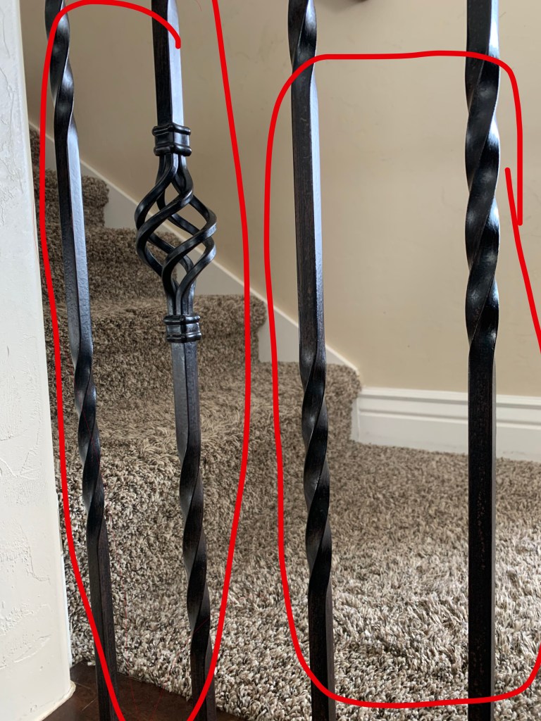
DEPTH OF FIELD
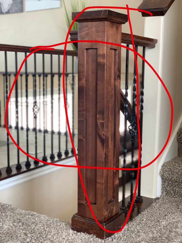
RULE OF THIRDS
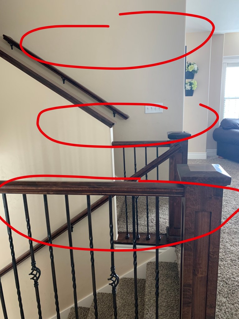
I wanted to use my own personal photos to represent the staircases in the original photo. I felt like my photos could replace the ones in the ad, but in the sense that it would change the overall feel. Rather than the photos being more modern, the color scheme in my photos is more rustic or traditional. I think that my photos could be used in the advertisement, because they are unique and display the small things that home improvement ads usually feature.
CONCLUSION
Overall, the original ad represents a good magazine spread. It shows great use of typefaces, photography, and contrast. The developer knew exactly how to play the photographs together and how to make them appealing to the eye. The typeface chosen represents exactly how the advertisement is supposed to be viewed. With these elements, the overall design was spot on.

