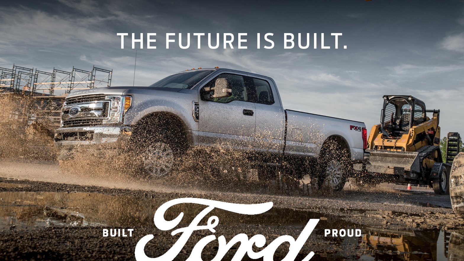
This is a 2018 Ford Campaign Advertisement, presented by Ford. With the logo for this ad being “The Future is Built” the campaign goes on to highlights the companies passion for building great vehicles over the past 115 years. The original design was created by the Ford Media Center. The campaign ad can be accessed here: https://media.ford.com/content/fordmedia/fna/us/en/news/2018/10/19/built-ford-proud-new-ad-campaign.html.
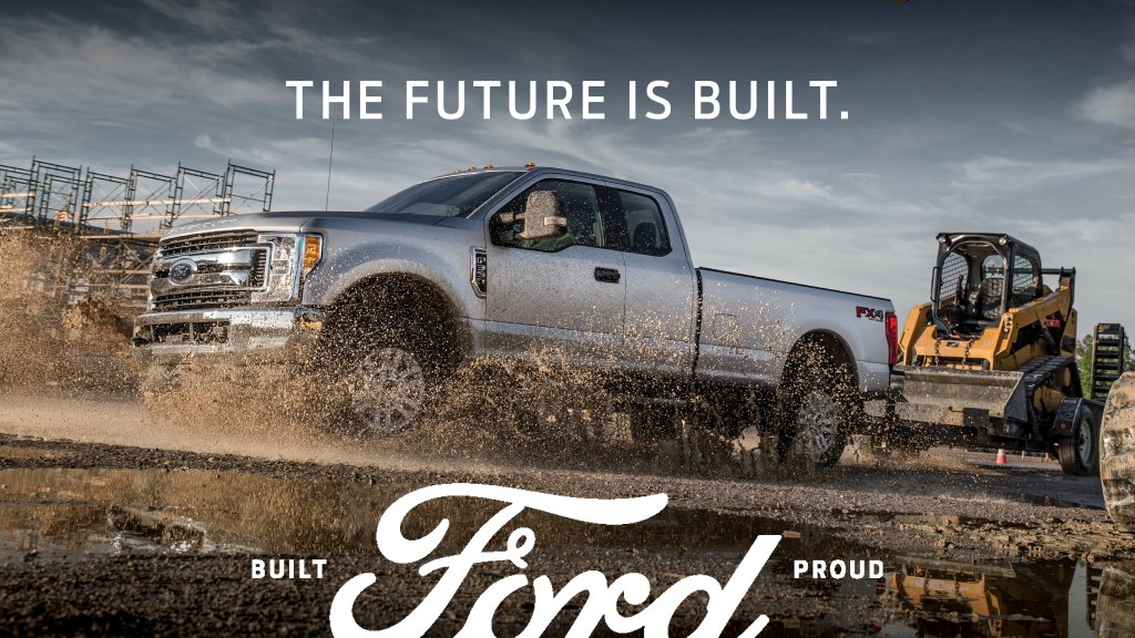
Design
Contrast
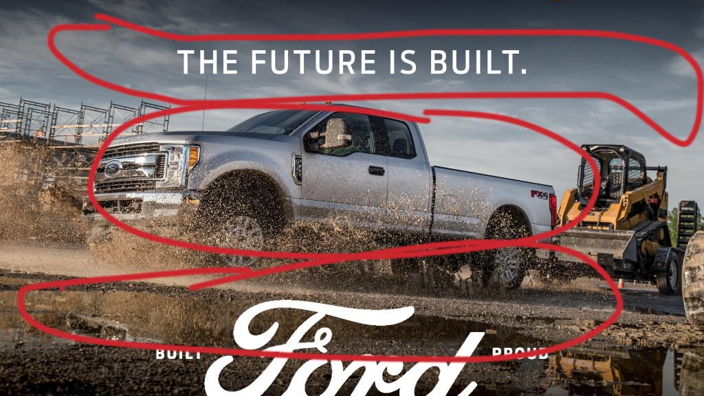
The contrast in this ad is quite bold. It has the dark, muddy ground up against the silver truck and light blue sky. It makes the truck and trailer stand out and appear to be the most important part of the advertisement.
Alignment and Proximity
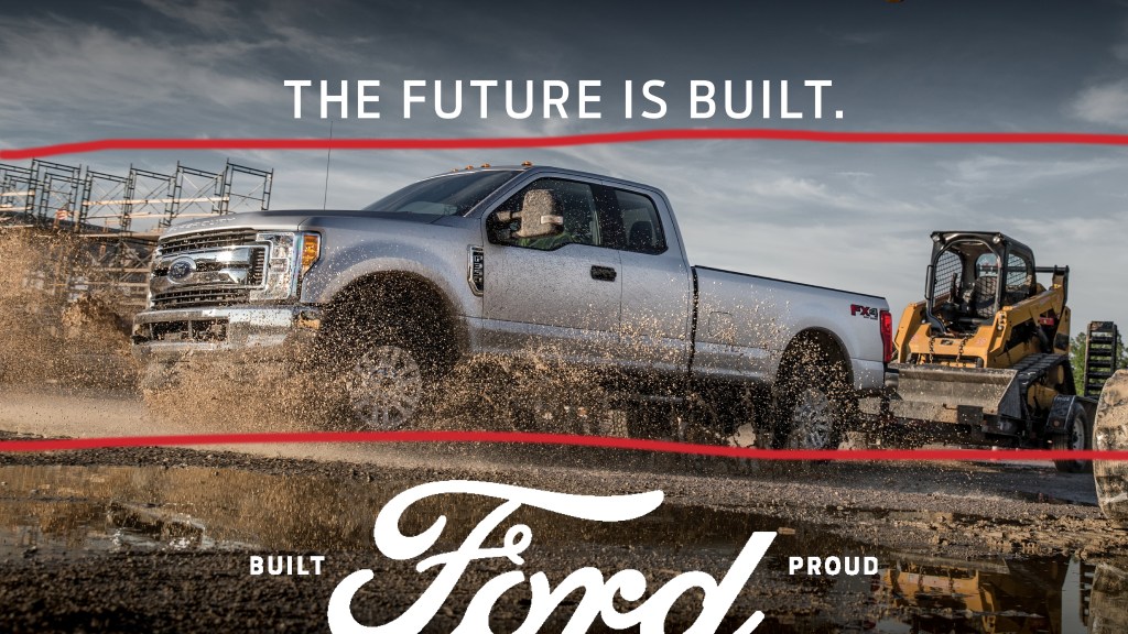
The alignment and proximity in this advertisement is pretty straight forward. The typography and image are centered on the page both vertically and horizontally. Make the advertisement easy to understand.
Repitition
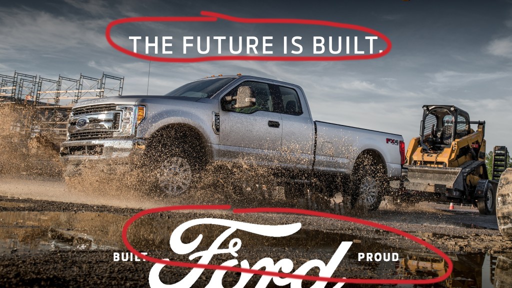
The most apparent use of repetition in the advertisement is the use of the white typography. It is used to stick out and make this advertisement recognized as a Ford Advertisement.
Color
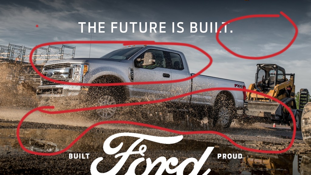
The color use on the ad is quite contrasting on the color wheel. The ground is dark compared to the light colored truck and light colored sky. The color choice of the truck for the advertisement is a great choice too, because silver is such a popular color of vehicle. Overall, the color usage is great because it is exactly what you would expect to see when you think of a truck.
Typography
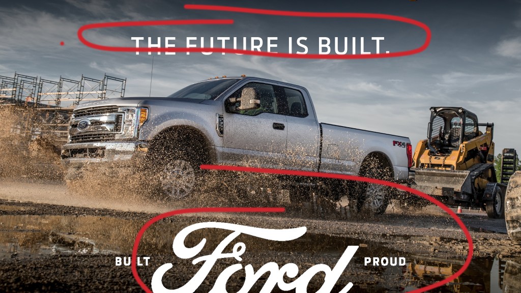
The advertisement uses both serif and sans-serif fonts. The top headline uses sans-serif in a more thin style. The bottom typography uses both serif and sans-serif. The words “built” and “proud” are an example of sans-serif and “ford” is an example of serif with the curved ends.
New Ad Campaign
Design
Contrast
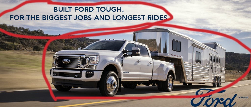
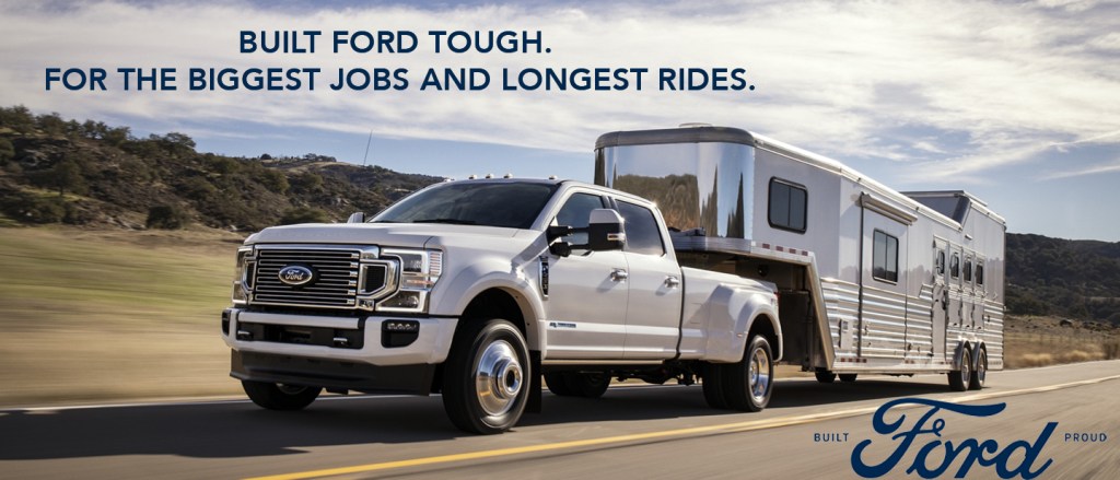
The contrast in this advertisement is less bold than the other advertisement. The color of the truck against the road isn’t quite as different as the color of the truck and trailer up against the shadow on the road the truck is providing. The typography shows a good contrast in the sky because it makes it more notieable.
Alignment and Proximity
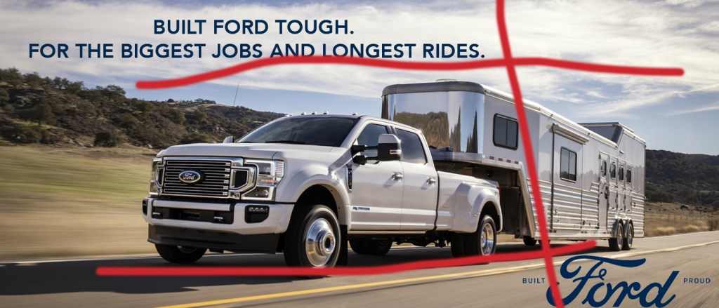
The alignment and proximity are similar to the first ad in the fact that the truck is centered both vertically and horizontally. The typography is placed differently and staggers to the left and right.
Repetition
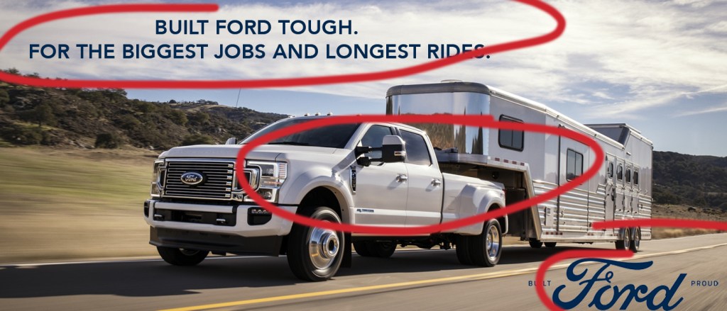
The truck and trailer are an obvious use of repetition, both being silver. The typography is also a good use of repetition because it uses the same color in the advertisement.
Color
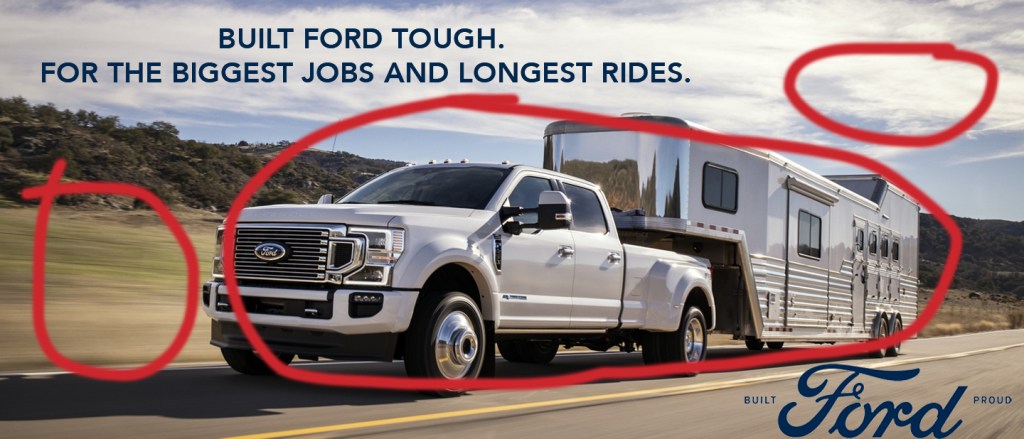
The colors used in this advertisement are carefully selected so the vehicle remains the focal point for the entire image. The colors all contrast in the sense they are different, but come together nicely when placed next to each other. The color of the truck was also chosen strategically in the sense that silver is a common vehicle color.
Typography
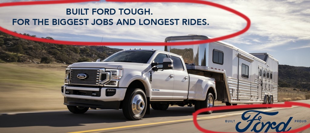
The typography used in this advertisement is similar to the first one. It includes both serif and sans-serif fonts. The top heading uses sans-serif with the straight edges. The bottom heading uses both serif and sans-serif. With the words “built” and “proud” being sans-serif and “ford” being serif with the curled edges.
Conclusion
In conclusion, both ads are great examples of design, color, and typography. They are both appealing to the viewer and get the product point across. They both represent what Ford stands for and what they want their viewers to view them as. Both advertisements would work great together in a campaign because they are cohesive in design elements. Overall, the both share the same overall message and idea.

