The Future is Built: FORD TOUGH.

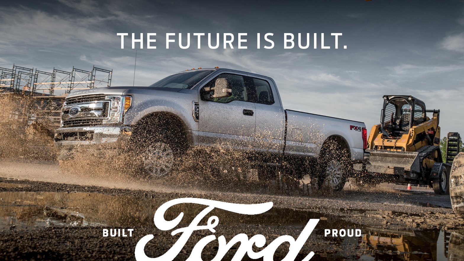
This is a 2018 Ford Campaign Advertisement, presented by Ford. With the logo for this ad being “The Future is Built” the campaign goes on to highlights the companies passion for building great vehicles over the past 115 years. The original design was created by the Ford Media Center. The campaign ad can be accessed here: https://media.ford.com/content/fordmedia/fna/us/en/news/2018/10/19/built-ford-proud-new-ad-campaign.html.
Design

Contrast
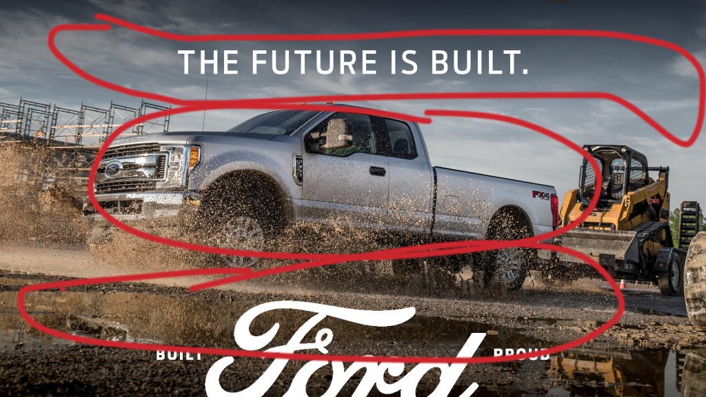
The contrast in this ad is quite bold. It has the dark, muddy ground up against the silver truck and light blue sky. It makes the truck and trailer stand out and appear to be the most important part of the advertisement.

Alignment and Proximity
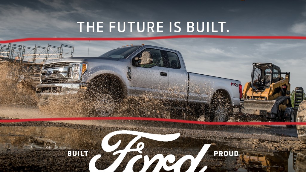
The alignment and proximity in this advertisement is pretty straight forward. The typography and image are centered on the page both vertically and horizontally. Make the advertisement easy to understand.

Repitition
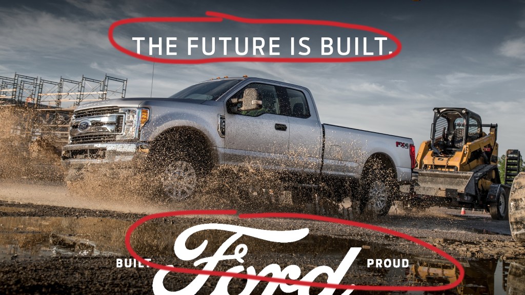
The most apparent use of repetition in the advertisement is the use of the white typography. It is used to stick out and make this advertisement recognized as a Ford Advertisement.

Color
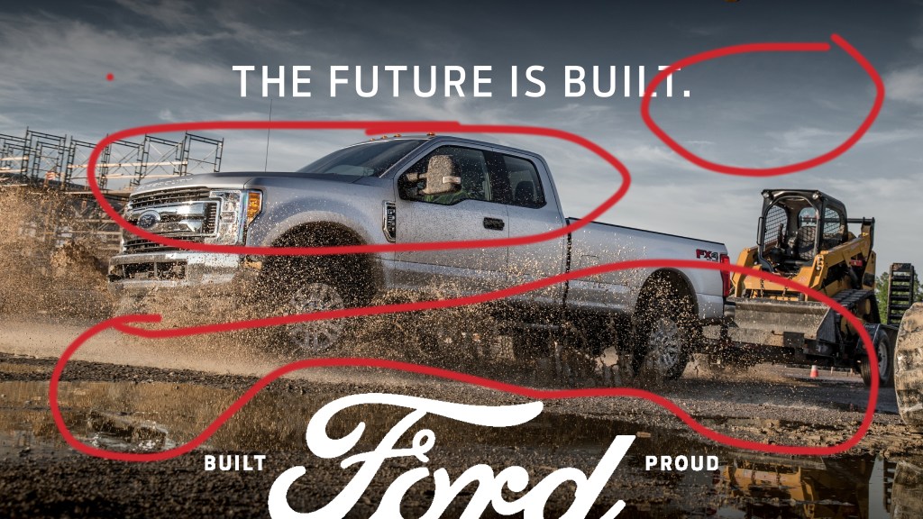
The color use on the ad is quite contrasting on the color wheel. The ground is dark compared to the light colored truck and light colored sky. The color choice of the truck for the advertisement is a great choice too, because silver is such a popular color of vehicle. Overall, the color usage is great because it is exactly what you would expect to see when you think of a truck.

Typography
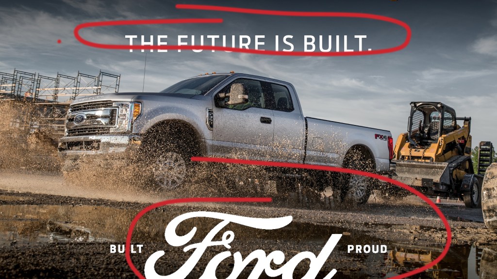
The advertisement uses both serif and sans-serif fonts. The top headline uses sans-serif in a more thin style. The bottom typography uses both serif and sans-serif. The words “built” and “proud” are an example of sans-serif and “ford” is an example of serif with the curved ends.

New Ad Campaign
Design

Contrast
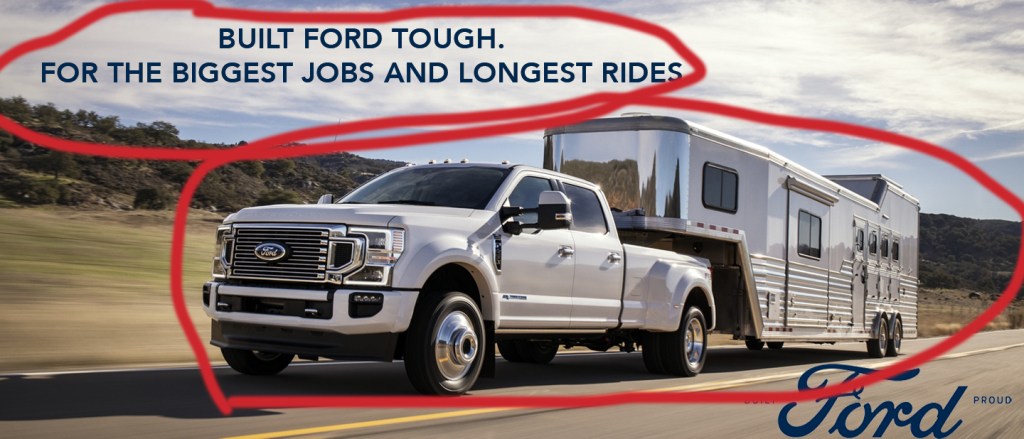
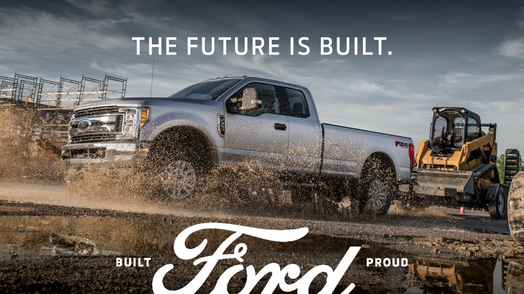
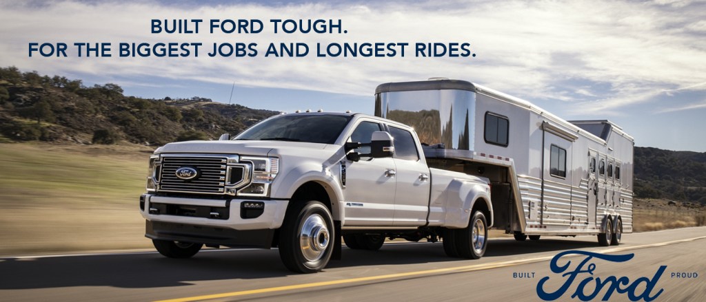
The contrast in this advertisement is less bold than the other advertisement. The color of the truck against the road isn’t quite as different as the color of the truck and trailer up against the shadow on the road the truck is providing. The typography shows a good contrast in the sky because it makes it more notieable.

Alignment and Proximity
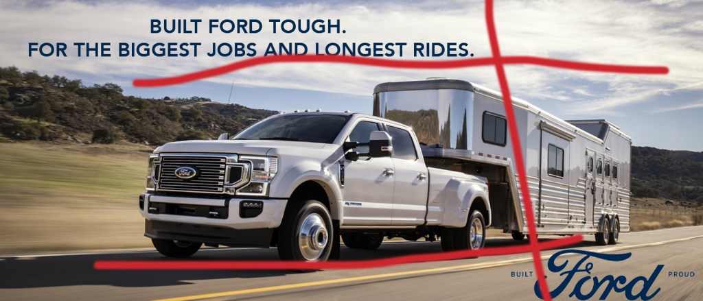
The alignment and proximity are similar to the first ad in the fact that the truck is centered both vertically and horizontally. The typography is placed differently and staggers to the left and right.

Repetition
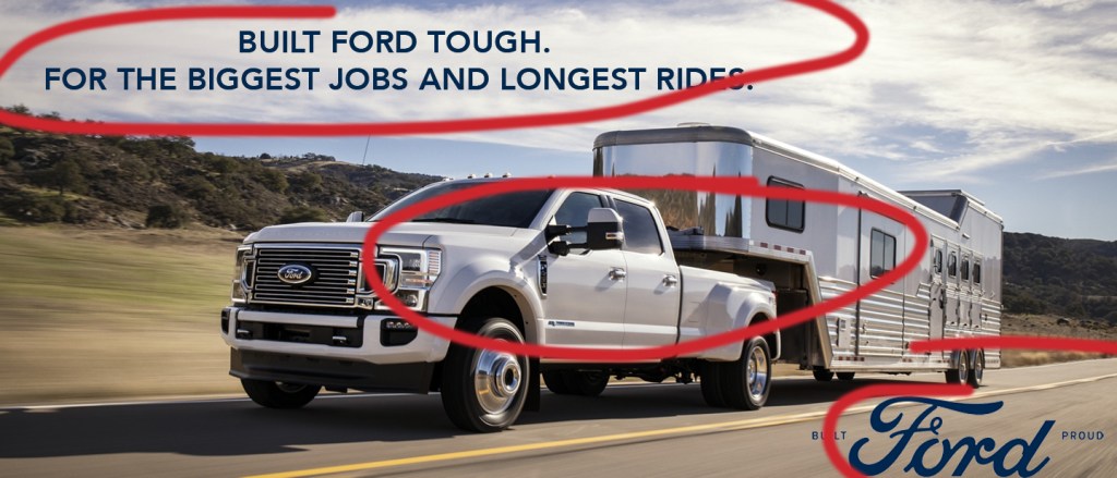
The truck and trailer are an obvious use of repetition, both being silver. The typography is also a good use of repetition because it uses the same color in the advertisement.

Color
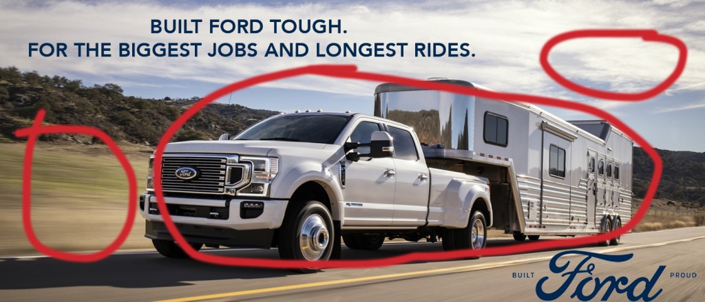
The colors used in this advertisement are carefully selected so the vehicle remains the focal point for the entire image. The colors all contrast in the sense they are different, but come together nicely when placed next to each other. The color of the truck was also chosen strategically in the sense that silver is a common vehicle color.

Typography
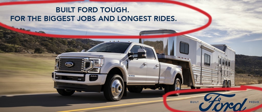
The typography used in this advertisement is similar to the first one. It includes both serif and sans-serif fonts. The top heading uses sans-serif with the straight edges. The bottom heading uses both serif and sans-serif. With the words “built” and “proud” being sans-serif and “ford” being serif with the curled edges.

Conclusion

In conclusion, both ads are great examples of design, color, and typography. They are both appealing to the viewer and get the product point across. They both represent what Ford stands for and what they want their viewers to view them as. Both advertisements would work great together in a campaign because they are cohesive in design elements. Overall, the both share the same overall message and idea.
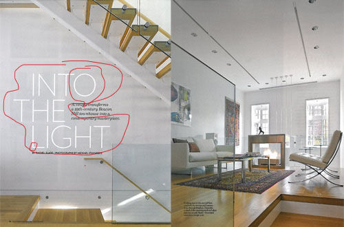
Boston Home Magazine: Type & Photography

INTRODUCTION

Photographs by: Michael Stavaridis

Website: https://www.bostonmagazine.com/2013/01/08/contemporary-beacon-hill-townhouse/

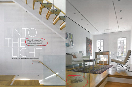
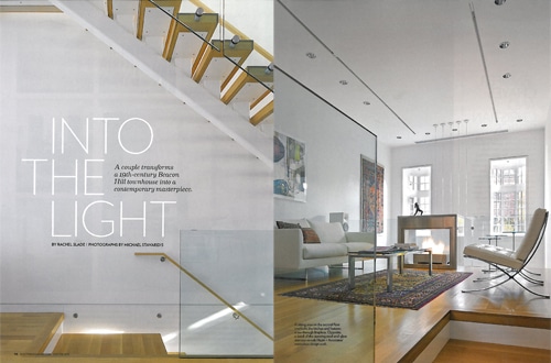
Featured in “Boston Home Magazine 2013” is this modern Townhouse. The photographs and typeface are modernly influenced. A couple transformed a “19th Century Beacon Hill Townhouse into a contemporary masterpiece.

ANALYSIS: Typeface

Sans Serif

The text shows two contrasting typefaces on the image. The first most noticeable text “INTO THE LIGHT,” is shown in Sans Serif. This can be labeled as a “Geometric” Sans Serif because the letters are geometrically shaped. Specifically the O’s. You could also notice there are no contrasts between strokes.

Serif

The next typeface shown is Serif. Simply because of the projection on the ends of the strokes. It shows angled ends and minimal contrast.

Contrast between the Typeface

The two types of typeface are contrasting in both size, style, and color. Immediately as the ad is looked at the viewers eyes are drawn to the Sans Serif, making it obvious that this is the most important part of the advertisement. After looking at that, then your eye is drawn to the rest of the text because it is much smaller and is noticeably less important.

ANALYSIS: Photography

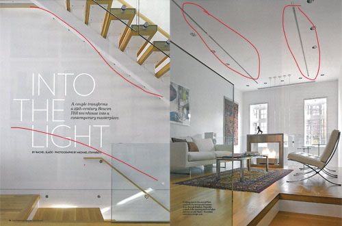
The photo on the left shows Rule of Thirds(vertically.) The white space between the two staircases divides both staircases into separate focal points. It shows the importance of each staircase. It also plays in the overall design of the theme.

The photo on the right is an example of leading lines. The decorative lighting on the ceiling is a leading point for the rest of the photograph.

3 Photos

LEADING LINES

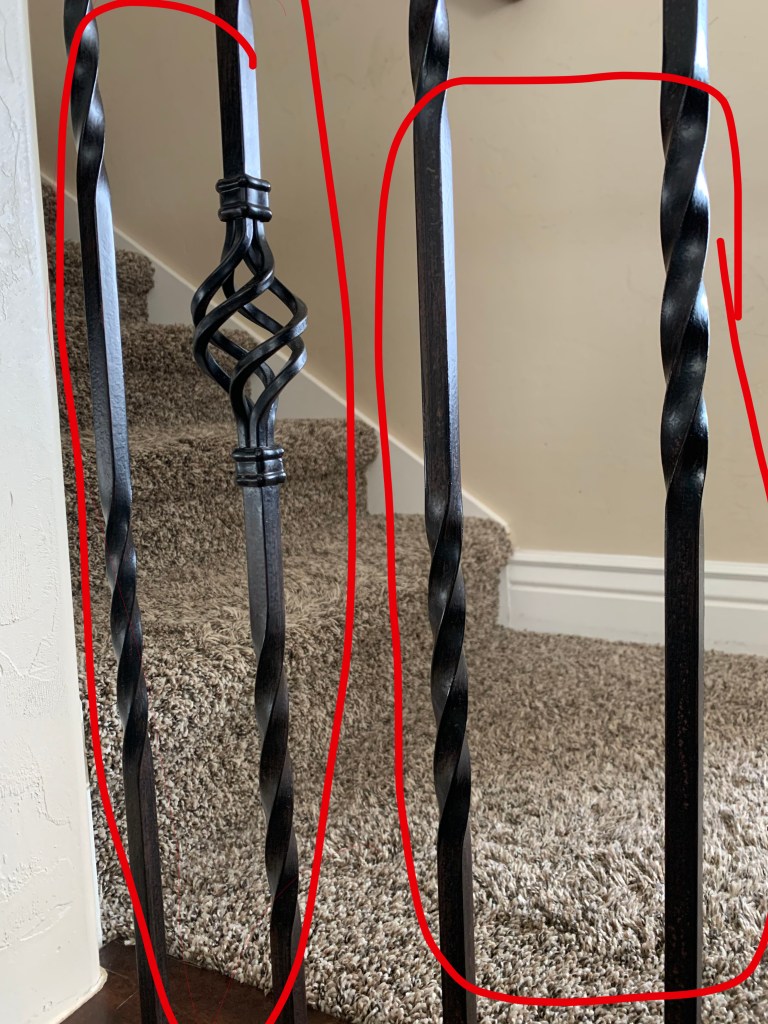
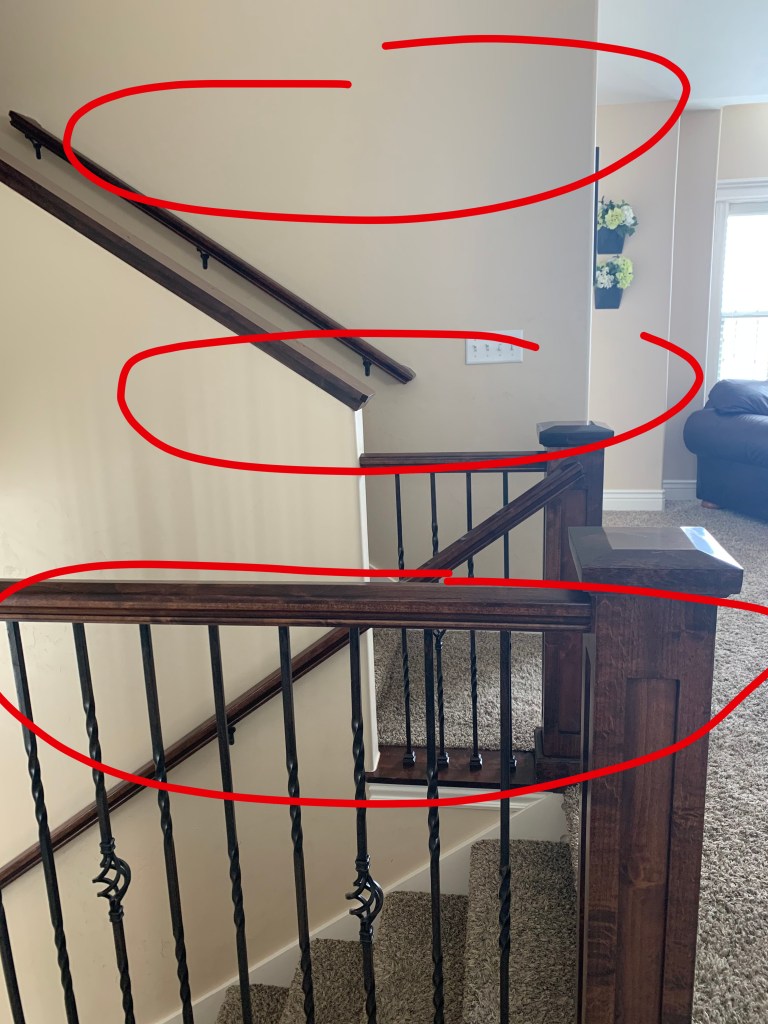
In this photo I tried to implement my staircase like in the original photos. I chose to take a photo of my railing because it represents a set of leading lines.

DEPTH OF FIELD

In this photo I continued to represent the stair case. I chose to make the banister the focal point and blur out the depth of field.

RULE OF THIRDS

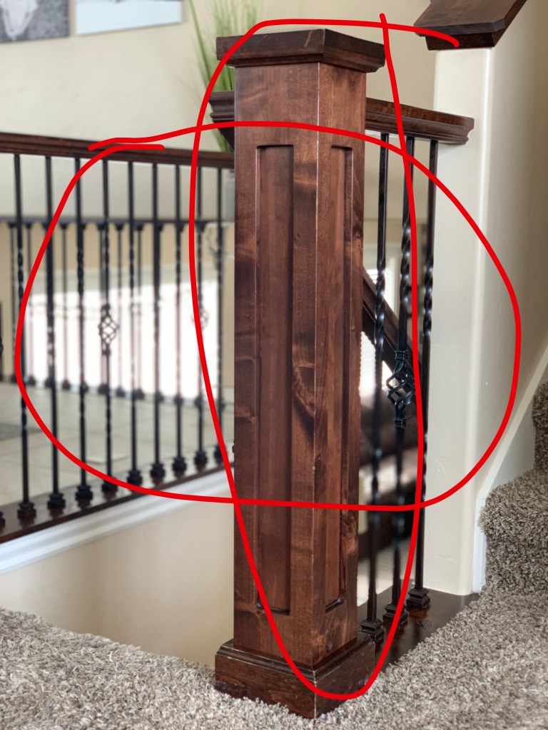
In this photo I chose to represent the Rule of Thirds. I made the staircases the focal points, but didn’t center them in the photograph.

I wanted to use my own personal photos to represent the staircases in the original photo. I felt like my photos could replace the ones in the ad, but in the sense that it would change the overall feel. Rather than the photos being more modern, the color scheme in my photos is more rustic or traditional. I think that my photos could be used in the advertisement, because they are unique and display the small things that home improvement ads usually feature.

CONCLUSION

Overall, the original ad represents a good magazine spread. It shows great use of typefaces, photography, and contrast. The developer knew exactly how to play the photographs together and how to make them appealing to the eye. The typeface chosen represents exactly how the advertisement is supposed to be viewed. With these elements, the overall design was spot on.

Open Happiness Below

INTRODUCTION

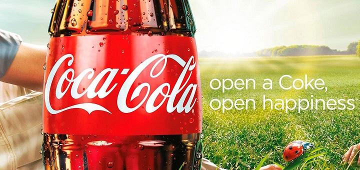
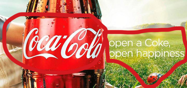
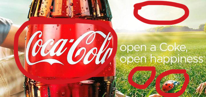
In 2009, Coca-Cola Company came out with an ad campaign called “Open Happiness.” Coca-Cola started this campaign to encourage people to find happiness in the simple things in life (while enjoying a Coke of course.) This campaign was developed by the Wieden and Kennedy Creative agency.

ANALYSIS

CONTRAST

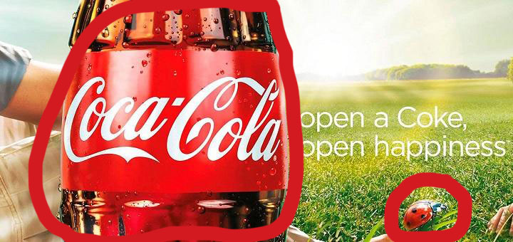
Contrast is quite recognizable by looking at this ad. Right away, the first thing you notice is the Coca-Cola bottle. It informs the viewer this is a Coca-Cola ad. Not only is the bottle enlarged, but it has a brighter more iridescent color. The lady bug is also in contrast with the rest of the advertisement. The lady bug is much smaller in contrast to the large Coca-Cola bottle, but like the bottle it’s colors are brighter in contrast with the background.

REPETITION

Repetition is used by using both forms Coca-Cola can be recognized by. Everyone knows that a Coke is Coca-Cola and Coca-Cola is a Coke. The advertisement uses repetition to let their viewers recognize who the advertisement is for.

ALIGNMENT

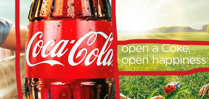
The alignment of this ad is appropriate for allowing Coca-Cola to get their point across. The Coke bottle is aligned on the left side of the image. This is a good strategy because as humans we read left to right. Automatically our eyes start on the left side and recognize the contrasted Coke bottle. The text on the ad is aligned on the right side and centered both vertically and horizontally. It’s a subtle placement compared to the large Coke bottle.

PROXIMITY

The elements in this advertisement are located in close proximity to each other. The Coke bottle is placed next to the text and lady bug because they all tie into the overall message of the ad. Just from looking at the proximity of the elements you recognize that by opening a coke you are able to recognize the simpler things in life.

COLOR

The color scheme portrayed in this advertisement is essential to sending the right message. The classic red color is a signature to Coca-Cola and next to the subtle, simpler colors of the surrounding elements shows that the main focal point is the Coke. The lady bug is also the red color and helps the viewer recognize it’s importance.

CONCLUSION

This advertisement proves to be precise and straight to the point. Open a Coke, enjoy the small things in life. Even though this advertisement is straight to the point, it also helps you take a step back and try to recognize the simpler things in life.

Coca-Cola presented an advertisement with good design elements. Altogether the use of contrast, repetition, alignment, proximity, and color used properly make for a great advertisement.

All About Me

This blog is all about me and my progress as a student at BYU-Idaho.

My name is Abby Lambson. I am a wife, mother, student, and daughter of God.

Some facts about me:

  • I love FOOD. My favorite food is sushi.
  • I archery hunt.
  • I am from Logan, Utah.
  • My parents are divorced and I have 8 brothers and sister between the two.
  • I have three kids.
  • I love being outdoors.
  • I love having a lot on my plate.
  • I also love Disneyland.
Design a site like this with WordPress.com
Get started